
Demo Section Page for new design blocks with content and CTAs. (Hero text property)
Bottom intro text property
This page and its subpages were built to show you the redesign components for the Wilhelmsen website. The process is ongoing, and this page should help you navigate through the blocks when creating or migrating pages.
This landing page shows you one or two use cases for each block. In every section, you will also find a link to the dedicated page for that particular block, where you can learn even more.
In the Edit mode, you can see all the blocks in the Main content area and the page setup.
Due to two front-end layers, the content types currently have multiple properties. Iterative improvements will be added in the upcoming weeks or months, both for the whole website setup and for this demo section.
To show you what properties can be used for the new design, the content of this page was built by displaying the properties' names directly in the components.

Pre title
Text and Image block (Title)
[Text and Image Block description property]
In this block, you can change the background colour and manage the content in the RTE. Block Options:
You can set multiple CTA types: buttons, links, primary and secondary.
With the checkbox, you can switch the image/text position.

Accordion Block - new design - 2 columns(2):
2 column Accordion - Header
Content
Content
Content
Content
Content
1 Column Accordion - Header
Content
Content
Content
Content
Content
Fact Column Block - Title
- Column title1Fact Block Text (Introduction)
- Column namewordNot only does the number work here. You can use one word instead of a number.
- Column Title3You can build multiple columns. 3 or 4 are optimal.
Columns Block - Optional title
Title of Column 1
This block is very flexible and can be used in various cases.
You can add an icon or thumbnail image above the column title.
You can also select one of the available block backgrounds, but be careful with colour selection and don't overuse this option.
Each column is defined separately (icons/images/colours).
Title of Column 2
You can also manage the row layout and select one of available settings:
- default (max. 4 in row, adjust to the number of the columns added in CMS)
- 33% 33% 33% - highly readable
- 25% 25% 25% 25% - better for shorter content piecec
- 50% 50%
But also, you can use mixed setups:
50% 25% 25%
25% 25% 50%

Column with icon
If your icon has a background, set the column background properly.
Remember that the page background is neutral yellow, not white.
Column with icon 2
Even though you can mix columns with and without icons, it's recommended to keep it consistent in one row.
Column with icon 3
If you wish to have more than one row of column items, add the next Column Block to create a new row.
In the block, you have two settings to hide the Top and Bottom spacing so you can manage the distance between the rows.
Title of Column 4
For each column item, you can add multiple links in the dedicated content area.
You can place any text here. Since this is a separate component, you can put the body text wherever you want on the page.
Header Full Image Block - no margins
Header Full Image Block (with margins)
Secondary title
Title - you can change the font to match the image colors
Foto: [Image Caption] If you add this, the image has left-right margins
Secondary title
Title - you can change the font to match the image colors
Foto: [Image Caption] If you add this, the image has left-right margins
Introduction text
Heading
For every column, you can add optional Image, title, and intro heading
The font color is based on the selected background colour
Employee Teaser



Products
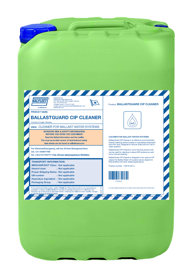
Prod no. 779210
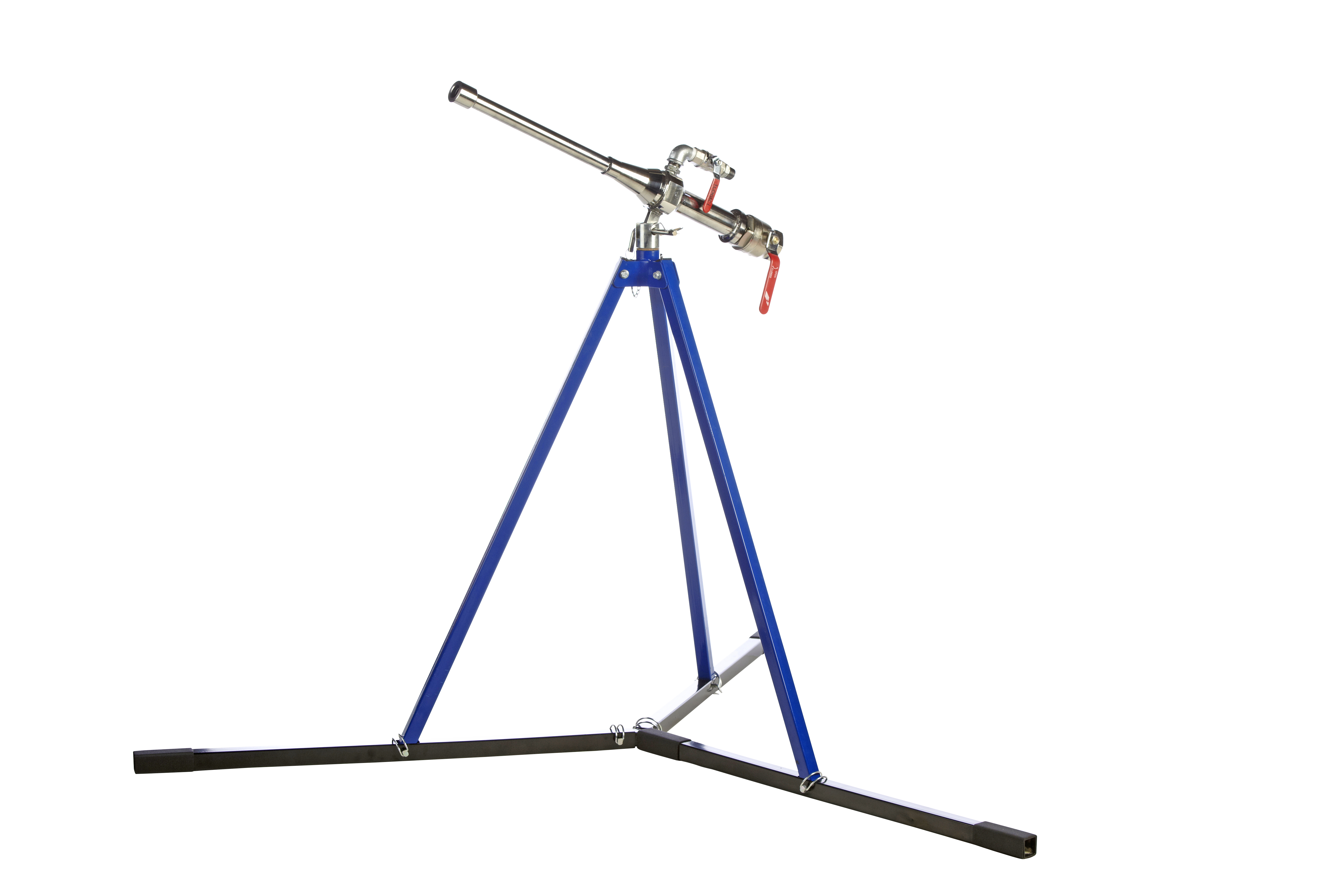
Prod no. 658229
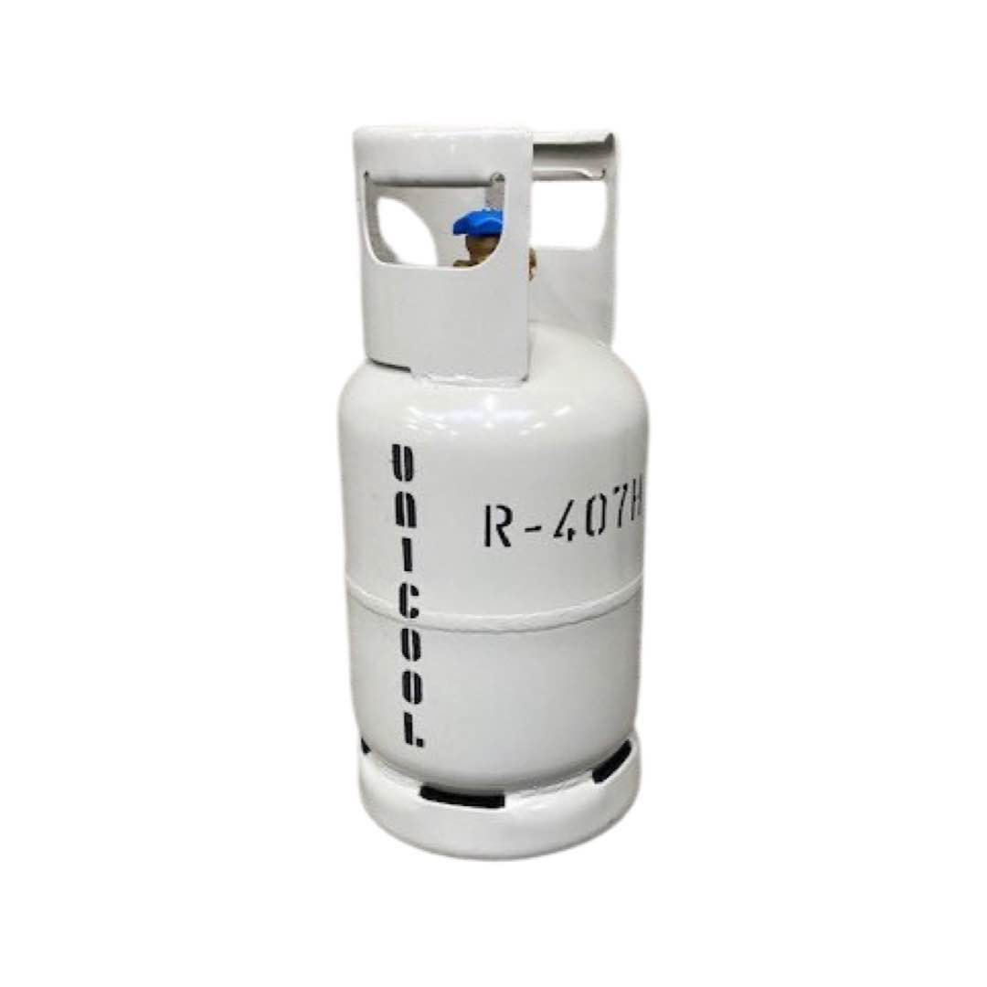
Prod no. 905761
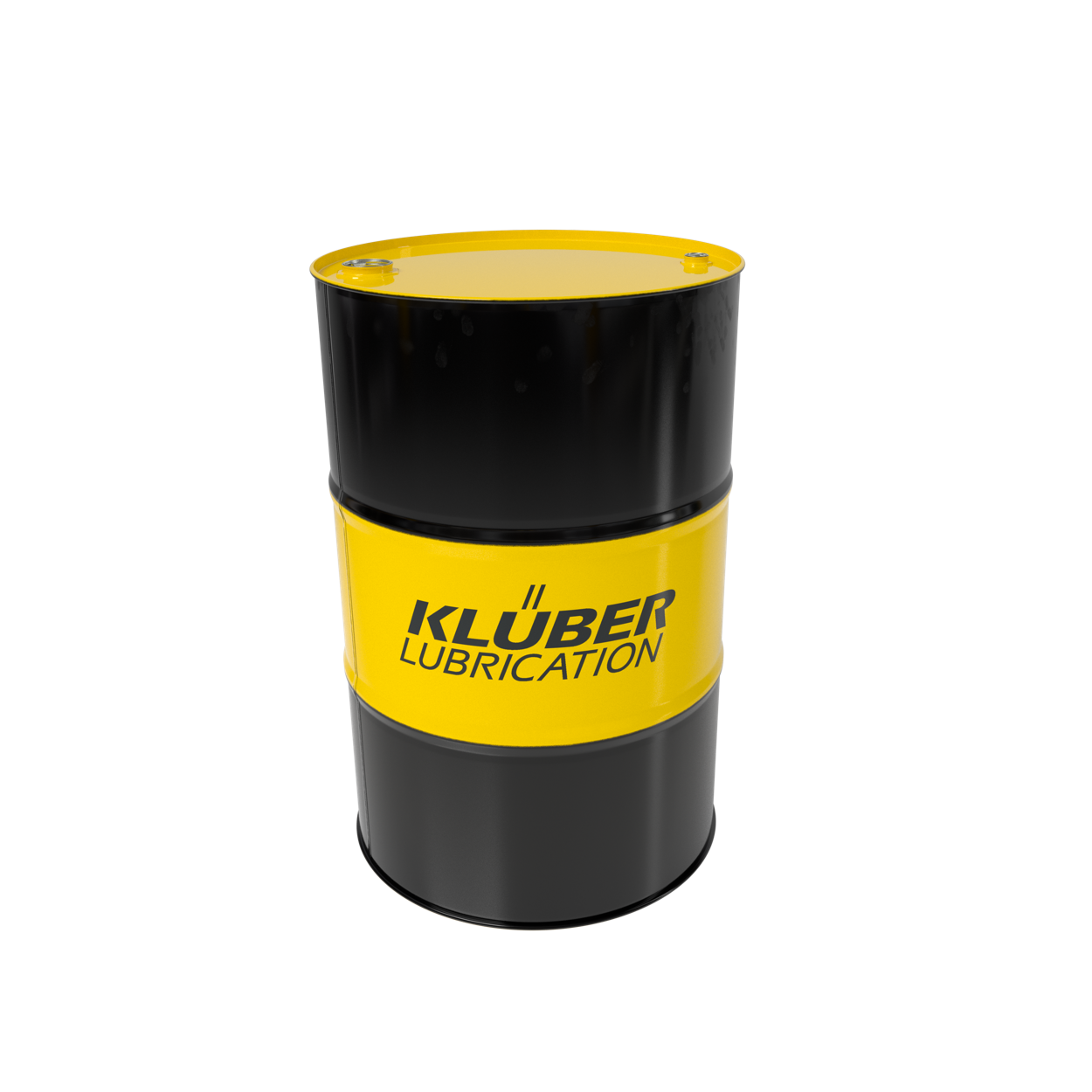
Prod no. 210067
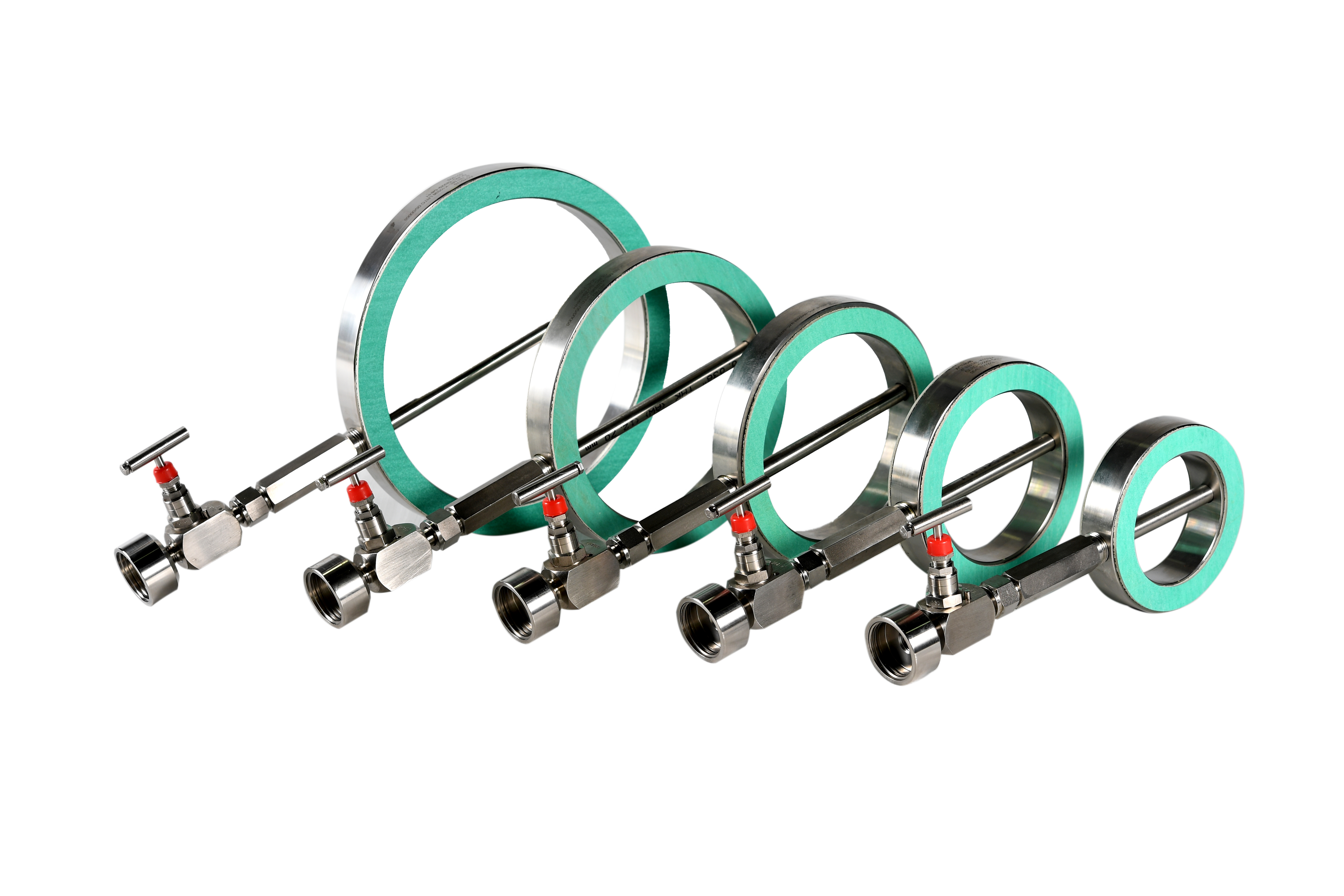
Prod no. Article-68982
Teaser List Block(2)

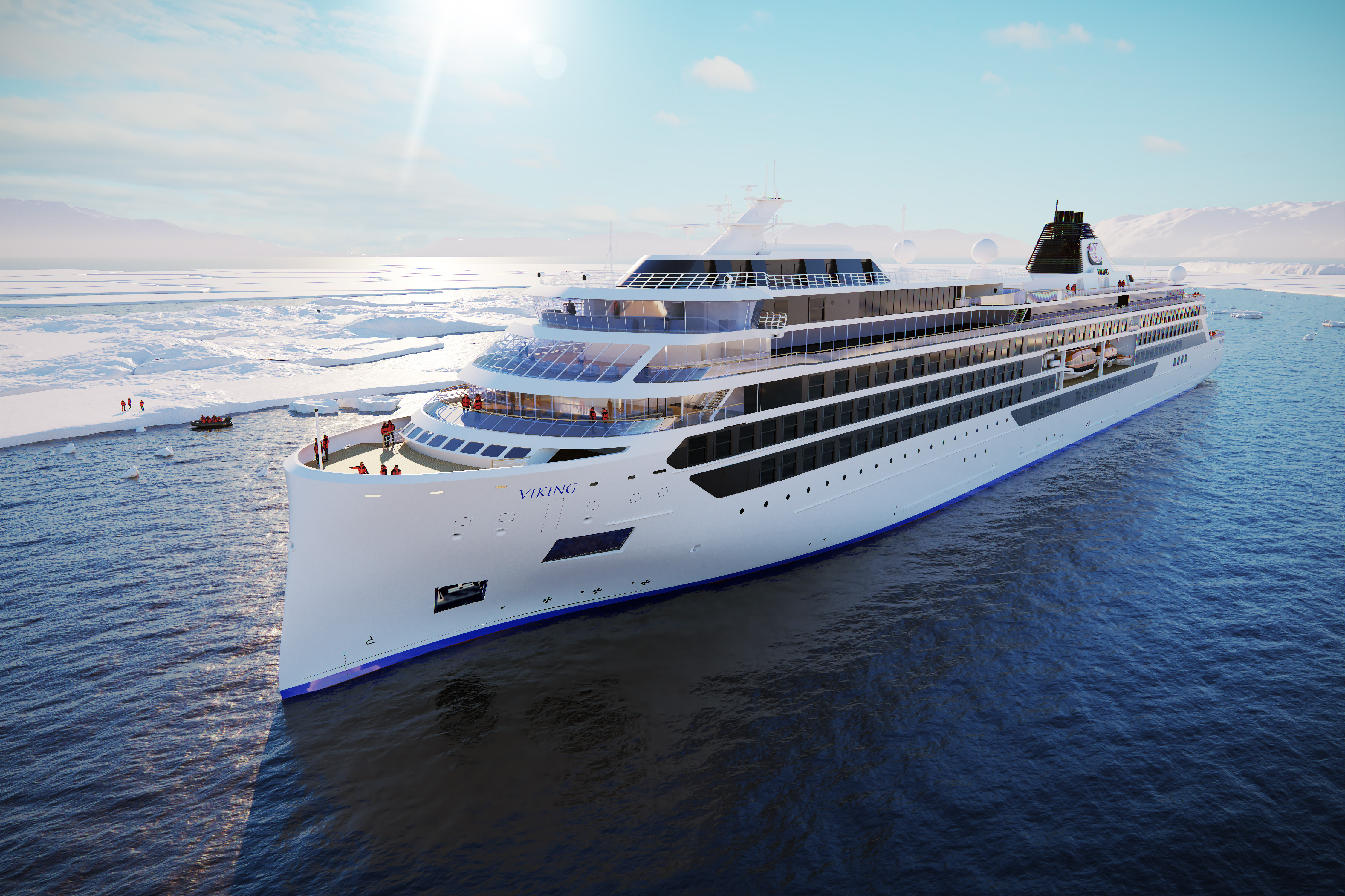



Page Preview Block - Demo navigation [title]
Selected pages prepared for demo purposes [description text]